Member-only story
Flutter UI Essentials —Material 3 SearchBar
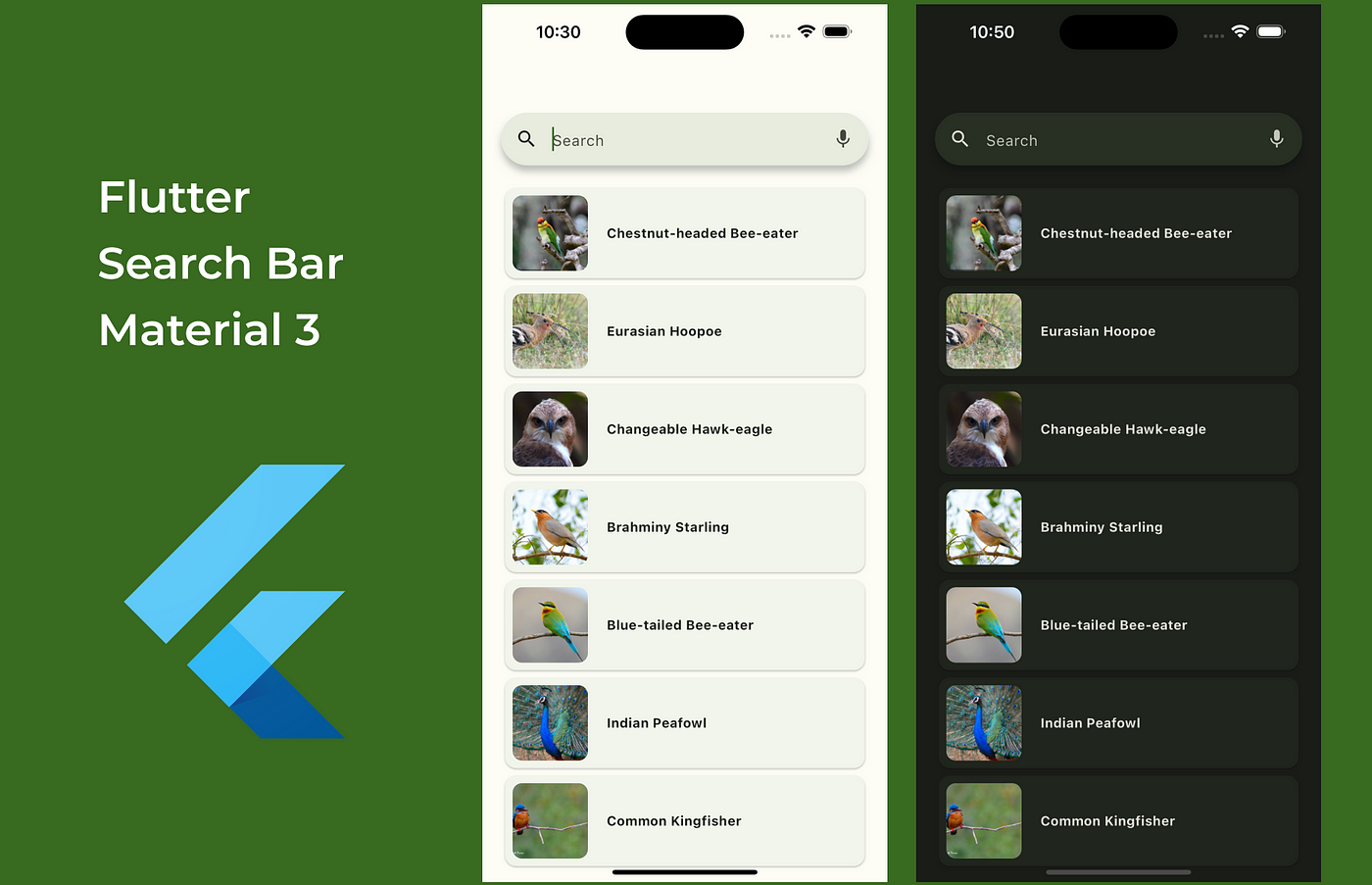
The search bar is a very common component that we use in our applications. In Flutter, we have many packages to easily implement a search. This article is about Material Design 3's search bar. You can find example code with a search implementation without using an external package.
Material 3 SearchBar
This is the material component for the user to enter a query as a keyword or phrase and get the available relevant information. The search bar is a well-known way for users to navigate a single item through search queries.
How should it be?
- When you select the search bar and type text, it will display dynamically recommended keywords or phrases.
- Interaction begins with the search bar, and results are always displayed in a search view to guarantee that there is enough space for results.
- We can include a leading search or menu icon and one or more trailing icons.
What’s new
- New component for search navigation
- Full M3 capabilities including dynamic color
Flutter SearchBar
This is a material design search bar. It includes a leading search icon, a text input field, and optional trailing icons.
The leading icon will be a navigational action or a non-functional search icon. When the text direction is LTR, the leading widget is on the left side of the bar.
The trailing is an optional list of actions with one or two action icons. These actions can be an additional search mode like voice search or a separate high-level action like current location or overflow menu.
Flutter SearchBar Widget with Properties
  const SearchBar({
    super.key,
    this.controller,
    this.focusNode,
    this.hintText,
    this.leading,
    this.trailing,
    this.onTap,
    this.onChanged,
    this.constraints,
    this.elevation,
    this.backgroundColor,
    this.shadowColor,
    this.surfaceTintColor,
    this.overlayColor,
    this.side,
    this.shape,
    this.padding,
    this.textStyle,
    this.hintStyle,
  });
Search bar configurations
- With avatar
